Healthcare Marketing: Your Lab Report is Gibberish. How Good Design Improves Health and Doctor-Patient Communications

Understandable data informs & educates
A physician’s reading list is more likely to include JAMA than Wired magazine. Although the tech-centric journal seems an unlikely source, this month’s edition (Dec 2010) provides a vividly illustrated case example for marketing communications.
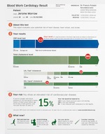
Doctors, hospitals and clinical labs in particular will find a brief but dramatic lesson in how good graphic design can contribute to better patient care, healthcare marketing and improved doctor-patient communications.
Typically incomprehensible lab reports don’t have to be...um, incomprehensible. “Better design and more context,” they say speaking as a patient, “can clarify the [lab] results— and help us understand our options.”
Perhaps Wired was inspired by our recent post: Branding in Unlikely Places: Using Patient Friendly Billing Statements in Hospital and Medical Marketing. We talked about how branding can enhance the patient experience even on billing statements that are clear, concise and easily understood.
The magazine applies the same idea to indecipherable lab reports. The article, The Blood Test Gets a Makeover, combined the talents of three graphic designers with the medical expertise of Lisa Schwartz and Steven Woloshin, physicians at the Dartmouth Medical School Institute for Health Policy and Clinical Practice.
The enlightening before and after images speak for themselves in makeover examples for The Basic Workup, The Heart Disease Test, and The Prostate Test. Effective design puts a face of understanding on the medical technology. And it’s an opportunity to inform with a level of understanding that improves patient health and doctor-patient communications. It's also a place to extend your branding message, both visually and in an improved patient experience.
Read more about brochures, branding and effective patient communications in medical and healthcare marketing here on the Healthcare Success website.
Related Articles:
Doctors, Please Watch Your Language. When Medical Jargon Kills the Marketing Message.
Why the Best Looking Medical Website Designs Still Fail
Pretty Poison: When Graphics Kill Your Healthcare Marketing Message
10 Healthcare Website Design Tips that Deliver Patients
7 Insightful Tips for Better Healthcare Marketing Direct Response Results


