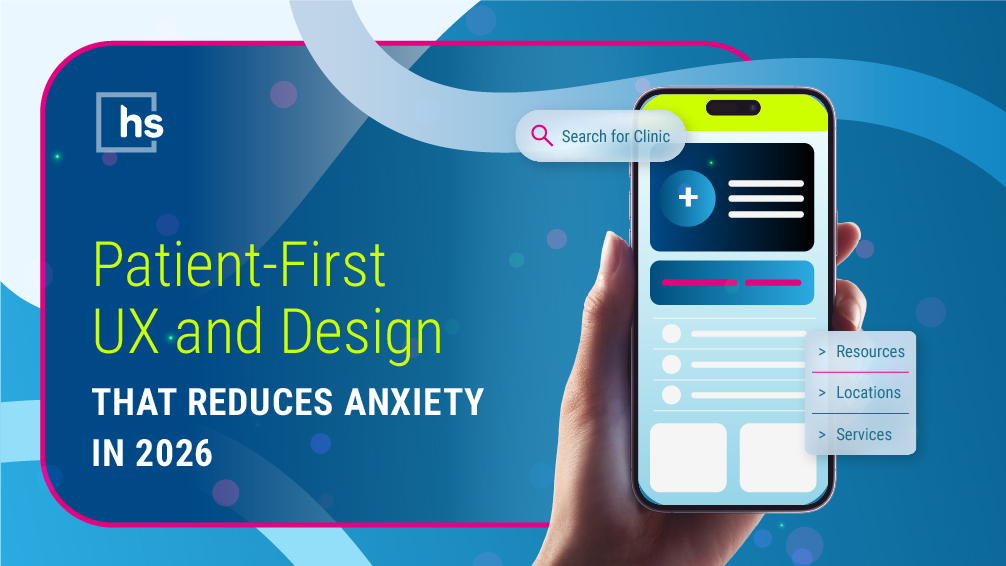
Patient-First UX and Design That Reduces Anxiety in 2026
Before, most healthcare websites focused on content and design that appealed to internal stakeholders because simply having an online presence was enough.
But in 2026, cluttered layouts, confusing navigation, and corporate jargon quietly kill conversions. Leaders tell us, "Look, our website looks great! We just redesigned it!" Sure, the homepage may look good, but a pretty site that gets ignored by AI systems an outdated one.Patients and AI systems experience your site as a series of tasks: finding a location, a doctor, a service, and the next step. Your site needs to be visually engaging and functional.
When patients, families, clinicians, and buyers arrive on your site via AI answers and rich search results, they come with very specific questions and very little patience. If your site was built for committees rather than for humans, the UX problems do more than hurt digital performance—they increase user anxiety, diminish trust, and send high-value visits back to search or into someone else’s funnel.
In this context, a high-performing healthcare website has to be patient-first by design: visually engaging but calm, easy to scan, crystal clear about next steps, and accessible on any device and channel. This article walks through practical UX and design principles that reduce anxiety and move people confidently toward care, referrals, or the right B2B conversations.
This article is Part 2 of 11 in our AI‑Era Healthcare Website Playbook.
Stressed users scan; they don’t read.
Decades of usability research and real-world analytics show that people rarely read websites word-for-word because they scan for what matters. For example, Nielsen Norman Group has consistently found that users read only about 20%–28% of the words on a page. In healthcare, this is amplified by stress. Users skim for reassurance and clear answers to a few critical questions:
- Am I in the right place?
- Do I trust you?
- What should I do next?
If your design and content make those answers hard to find, users bounce back to Google or an AI assistant, often choosing another organization that feels clearer and more trustworthy. Research from Gartner shows that reducing customer effort is one of the strongest drivers of customer loyalty—and a more reliable predictor than traditional satisfaction metrics.
AI and search now expose UX weaknesses.
AI-generated overviews and rich search features increasingly surface not only your content, but also how well your site is structured and understood. According to Gartner, traditional search behavior is swiftly evolving as AI reshapes how users discover and evaluate providers—compressing consideration into fewer, more decisive interactions.
Sites with confusing structures, hidden access, and weak E-E-A-T signals are less likely to be highlighted for patients and professionals. Patient-first UX is directly tied to visibility, volume, and growth.
Why patient-first design matters more than ever
In a pre-AI world, clunky UX was mainly an annoyance. People were more willing to click around, call the main number, or tolerate a confusing experience if they already trusted your organization.
In 2026, that tolerance is gone. Visitors arrive from AI answers and campaigns with an objective in mind and plenty of alternatives if they can't find what they're looking for. Each extra click or vague label leads to lost appointments and unnecessary call center volume.
Patient-first design matters now because it is one of the few levers you fully control between “we paid to get users here” and “they actually completed a high-value action.”
A clearer homepage, more intuitive navigation, and calmer, more direct content routinely lift completion rates on key flows—online booking, contact forms, referrals, demos—without increasing your media budget. Industry studies (including SEMrush analyses) show that improving UX and reducing friction can significantly increase conversion rates without additional traffic.
Put simply: in the age of AI and shrinking organic clicks, patient-first UX is important for how your website earns its share of growth. Without it, competitors with clear and easy experiences will take your users' attention.
Principle 1: A homepage that calms, orients, and routes
The homepage is often the first impression for stressed visitors and the hub for many. A patient-first homepage avoids overload and quickly orients users to the right place.
1. Lead with clarity, not slogans
Instead of opening with vague taglines, make it obvious who you serve and how you help. For example:
- “Care for every stage of life in [region]—primary, specialty, urgent, and virtual.”
- “Specialized behavioral health and addiction treatment for adults and families.”
- “Virtual-first chronic care for people living with diabetes and hypertension.”
This sets expectations and reduces the “Am I in the right place?” anxiety.
2. Use design that reduces mental effort
Visually noisy homepages raise stress and hide key paths. Patient-first design uses generous whitespace and clear hierarchy.
- High-contrast text and accessible typography.
- Limited color palette with consistent use of accent colors for CTAs and alerts.
This doesn’t mean bland. It means every design choice is thoughtful and supports readability and focus, especially for users scanning on a phone.
3. Make “What should I do next?” obvious
From the hero area down, your homepage should make the most frequent next steps effortless, such as:
- Find a doctor.
- Find a location.
- Book an appointment.
- Access the patient portal.
- Refer a patient.
- Explore services.
- For B2B: request a demo, schedule a strategy call, or explore solutions.
These should be expressed as clear, visually prominent calls to action, not buried links or vague buttons.
Principle 2: Build trust into the experience
In healthcare, trust is a key conversion driver and not just a brand attribute. Patient-first UX makes it easy for users to quickly assess whether you are credible and safe.
Surface proof where it matters
Rather than hiding proof on separate pages, bring it into the journeys where decisions are made:
- Testimonials and outcomes on service and program pages.
- Provider credentials and experience near “schedule” and “contact” CTAs.
- Visible links or badges for accreditations, quality markers, or major partnerships.
Humanizing photos featuring clinicians, staff, and actual patients reinforces reality and inclusion.
You don’t need to overload the page with proof. You just need enough to justify the visitor investing more attention.
Principle 3: Navigation that resembles real mental models
Confusing navigation drives anxious users away. A patient-first website organizes content around how people think—not how your internal org chart is laid out.
Organize around needs, not departments.
Instead of leading with internal categories like “Clinical Services,” “Programs,” or “Divisions”, consider:
- Conditions and symptoms
- Types of care such as: primary, specialty, urgent, virtual, inpatient, outpatient
- Key audiences:“For patients and families,” “For referring providers,” “For employers and plans”
- Key actions:“Find care,” “Refer a patient,” “Join our team,” “Partner with us”
This approach helps patients, families, HCPs, and B2B buyers find the right resources on their own, without needing to understand internal jargon.
Make core tasks one or two clicks away.
High-value tasks should never be more than a click or two from anywhere on the site. That typically includes:
- Find a doctor/provider.
- Find a location.
- Schedule or request an appointment.
- Access the portal or telehealth.
- Refer a patient.
- Contact us or request a demo (B2B).
Persistent navigation, sticky headers, or well-designed utility menus should allow users to find these actions without cluttering the page and hunting down the action
Principle 4: Content that calms and guides
Write for real people, not committees.
Patients and families rarely speak in clinical or internal jargon. Patient-first content is:
- Plain language at an accessible reading level without feeling condescending.
- Structured as shorter paragraphs and scannable sections with descriptive headings.
- Explicit about what to expect, what to bring, and what happens next.
For clinicians and B2B audiences, add technical depth as needed, but ensure the key takeaway remains clear and usable for non‑experts.
Answer the questions they’re actually asking.
Analytics, call center logs, and clinician input can tell you what people ask most often. Use that to shape:
- Service and condition pages with FAQs, “when to call,” and “what happens at your first visit.”
- Location pages with detailed directions, parking info, transit options, and local landmarks.
- Treatment, program, or product pages with honest comparisons and next steps.
These precise, structured answers are exactly what AI tools look for when generating overviews and recommendations. SEO best practices and supported research from SEMrush shows that content aligned with user intent and clearly structured is far more likely to rank—and to be surfaced in rich results and AI-generated answers.
Principle 5: Bring brand and audiences to life in the UI
Make the brand feel real.
Brand isn’t just your logo and colors; it is how your organization shows up visually and verbally in the experience. To avoid the “generic hospital website” problem:
- Use photography and video that reflect your genuine patient populations, care settings, and regions. Think rural vs. urban, senior living vs. pediatrics, addiction recovery vs. elective services.
- Align your tone of voice with your brand—whether warm and reassuring, expert and direct, or innovation‑focused.
- Carry the same visual system and messaging hierarchy across home, service lines, provider bios, locations, and B2B sections.
Consistency reinforces trust and helps visitors quickly recognize they’re still within your ecosystem.
Design for multiple audiences without chaos
Your website has to serve many groups: patients, families, referring physicians and other HCPs, employees, candidates, community leaders, donors, health plans, and B2B buyers. The UI should make those paths visible without overwhelming people.
Patient-first UX does this by:
- Making audience pathways clear at the top level such as “Patients & families,” “Providers,” “Employers & partners”.
- Using audience-specific hubs that still share a coherent visual and interaction.
- Avoid dumping every audience in the main navigation; instead, use thoughtful grouping and cross‑links.
This way, each audience feels acknowledged while the experience remains unified and manageable.
Bringing it back to growth
Patient-first UX and design are not “extra polish” for after the real work is done. They are an ongoing process that turns awareness and interest into appointments, inquiries, referrals, and long-term relationships.
By calming users, clarifying paths, and removing friction at key moments, you:
- Increase completed high-value actions without increasing media spend.
- Reduce avoidable call volume and staff time spent rescuing confusing journeys.
- Build trust and loyalty because the digital experience finally matches the quality of care and solutions you deliver.
If your website still looks and behaves as if it were designed for internal stakeholders first, patient-first UX is one of the fastest, lowest risk ways to close the gap between what your brand promises and what users actually experience online.
More Reading
This article is Blog 2 in our 11-part Healthcare Website in the Age of AI series:
- Your Healthcare Website in the Age of AI: The New Epicenter of Growth
- Patient-first UX and Design That Reduces Anxiety in 2026
- Turning Healthcare Websites into Patient Acquisition Engines
- AI-Era SEO and Content Architecture for Healthcare Websites
FAQs
Q: Isn’t “patient-first UX” just code for making the site prettier?
No. A patient-first approach focuses on clarity of purpose, navigation, and friction in real tasks—finding the right information, booking, contacting, referring—not on visual polish alone. Prettier sites without better flows rarely move your numbers!
Q: We have multiple audiences. How do we stay “patient-first”?
Most UX improvements that reduce friction for patients—clear starting points, guided pages, better forms—also help clinicians, partners, and buyers. You can still create tailored hubs and flows; the shared principle is to design from the user’s task and anxiety, not your org chart.
What’s the quickest way to prove ROI on UX changes?
Pick one high‑value flow (e.g., online appointment requests or “contact sales”), baseline its completion rate, remove obvious friction, and re‑measure. Even a modest lift there is easy to quantify and easy to take back to the executive team..
Subscribe for More:
Don’t miss future insights—subscribe to our blog and join us on LinkedIn: Stewart Gandolf and Healthcare Success.