How Creative Advertising Images Turn Heads and Bend Minds
 We’ve been looking for a good springboard opportunity to present the creative advertising images that are included with this post. It’s difficult to characterize all the ways how-and-why reasons that good visuals turn your head, tell a story and/or bend your mind. And frankly, that’s an important secret sauce ingredient.
There aren’t many ad messages that succeed without an image. Pictures, graphs and visual elements communicate ideas about a million times faster than words alone. None of these images are healthcare related. But you can use the unusual ideas to inspire your Pay-per-Click advertising, website content, Facebook posts and advertising, newspaper and magazine ads, and outdoor presentations.
What makes creative excellence? An all-inclusive definition is elusive. It’s one of those things that you know it when it slaps you in the face. For advertising art, graphics or images, the visual element commands attention and at the same time, it delivers a message.
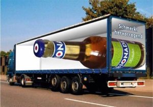
3-D Creative Advertising Images Taste Delicious…

This three-dimensional image (for a German beer) is a unique outdoor advertising presentation that travels around Europe on large trucks. The optical illusion is attention-getting (as many of these examples are), plus offers a simple, and delicious, message.
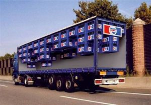
This Pepsi is really light…
When the Pepsi truck carries the “light” product, the cartons and cases magically float to the top of the trailer. This mind-shaking image communicates product benefits and attributes along with the branded name and colors.
Oversize brand image…
The German word Freitag translates to Friday. It’s also a brand of one-of-a-kind (upscale) bags and accessories that are made in part from recycled canvas truck tarps. What better way to connect a truck tarp idea with the still-on-the-truck product?
More tips for visual success…
Advertising artwork—like these examples—needs more than a clever visual twist. Here are some additional tips and techniques that pave the way to success:
Know the needs and interests of your audience. At the risk of repeating the first major rule of all advertising, begin with WHO you serve and HOW you can help them. Does this relate to them?
Nail down your precise message. All too often, it seems that pictures are chosen because they “kinda sorta” make a “maybe fit.” (Or because “that’s what we had at hand.”) Create a visual that tells a meaningful message that supports the business goal.
Only quality images will do. A grab-bag, “seen-it-before” image—either poor quality or a simply a bad selection—puts the campaign effort at risk. If the image isn’t good, the ad message will be lost quickly.
Reach out and touch emotions. Many purchase decisions are launched by an emotional idea. Perhaps the reader can identify with a particular benefit or situation.
And then there are the emotions that is part fun and amusing…and maybe a tiny bit on the scary side.
Consider how many personal reactions that result from this outstanding and realistic bus painting for a zoo. Can you relate?
Let us be your creative resource…
Your marketing and advertising plan might not include super graphics or ultra-realistic European painted trucks. But, since creativity is part of the work we do every day, go ahead and reach out to use. Call us today: 800-656-0907.
Related Articles:
Picture This: Using the Explosive Trend to Visuals in Social Media
If Patients Chose Doctors Based on How Creative They Are
Creative Thinking: How to Generate New Ideas for Better Healthcare Marketing
Keeping Up with a Picture Perfect World for Healthcare Marketing


