PlasmaSource Branding by Healthcare Success
The Work
PlasmaSource partnered with Healthcare Success to develop its new brand, visual system, website, communications, and clinical spaces. When you’re paying people for blood plasma, you need to ensure they’re comfortable.
Here’s how we did it.
Here’s how we did it.
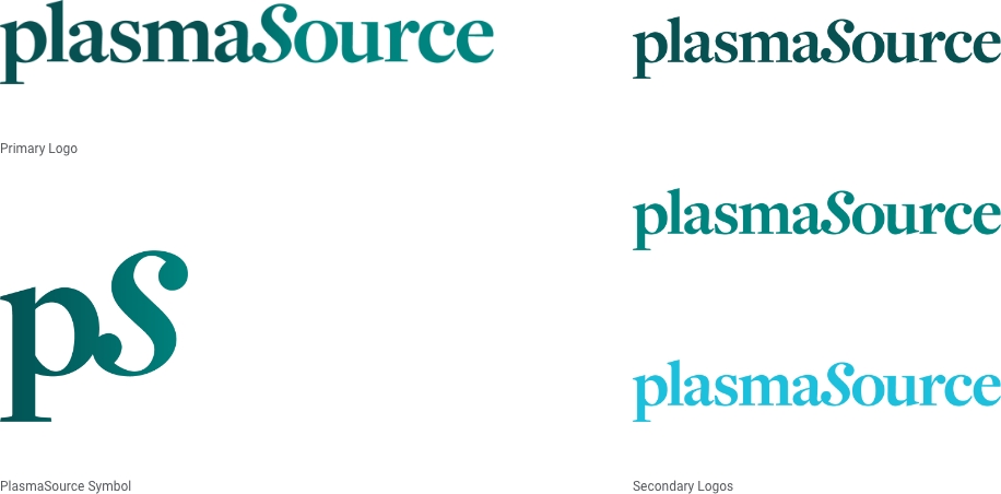
Identity: Logos
The PlasmaSource logotype is quiet and calm, with an air of simple elegance. It also speaks to partnership and sharing. The core mark and its symbol allude to the benefits of plasma donation — while reinforcing a comfortable boutique vs. a cold, clinical aesthetic.
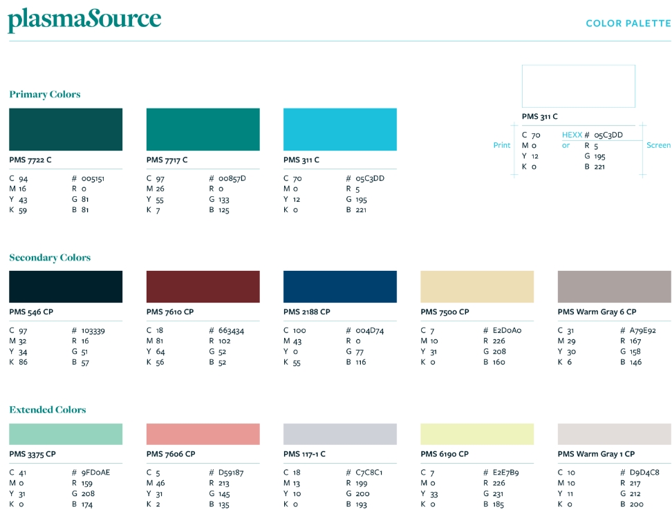
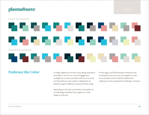
Identity: Color
The PlasmaSource color palette breaks away from the typical cold and impersonal clinical aesthetics and embraces warm earth and jewel tones instead. This shift builds upon their welcoming, comforting, and boutique-like experience.
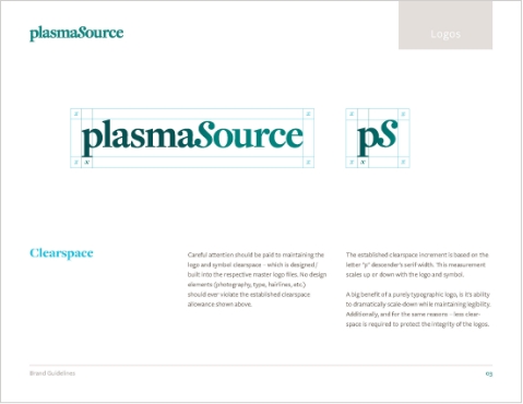
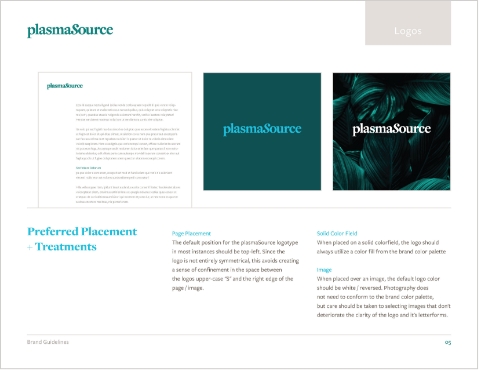
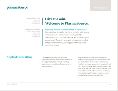
Brand Guidelines
Successful brands require careful application across multiple platforms and communication materials. The PlasmaSource Brand Guidelines use a combination of messaging, visual elements, and proper usage — to establish a unified and consistent voice for patients and employees alike.
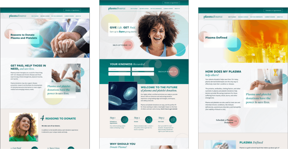
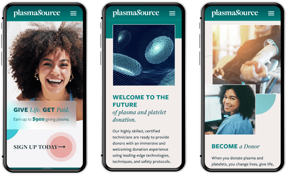
Website
Visit the WebsiteDonating blood plasma should be a positive and rewarding experience for the patient. With an eye toward the younger demographic, we developed the PlasmaSource website to convey a sense of optimistic vitality, hope, and excitement.
Visit the Website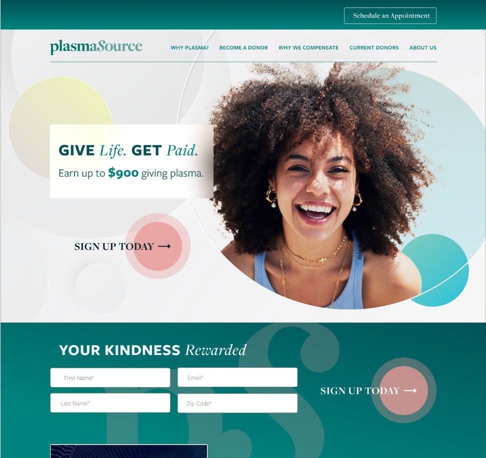
Environmental
Today’s healthcare consumers have a lot of options and, more and more, expect a certain level of comfort and pampering. Taking our cues from high-end boutiques and spas, the environmental design of the PlasmaSource clinics is warm, inviting, and natural. The imagery speaks to sharing and rebirth—the second chances PlasmaSource patients give to their communities.

Interior
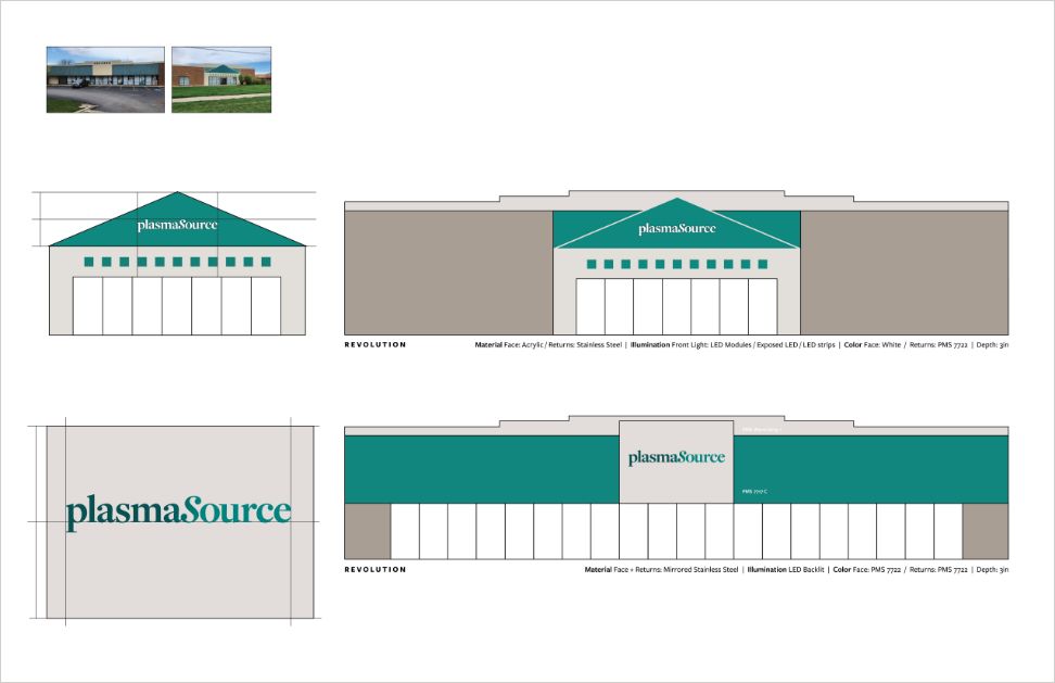
Exterior
Ready to explore a partnership?