Illinois Dermatology Institute Rebranding by Healthcare Success
The Work
Read The Case StudyIllinois Dermatology Institute (IDI) needed to refresh and clarify its brand identity and communications to reach new customers and better convey its leading-edge approach to skincare and dermatology treatments.
Read The Case StudyBrand
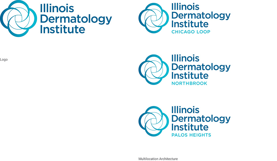
An established leader in its field, maintaining IDI’s brand equity with its patients and community was crucial. We created an evolved symbol paired with an improved type treatment to support a new brand architecture to accommodate its multiple locations.
Website
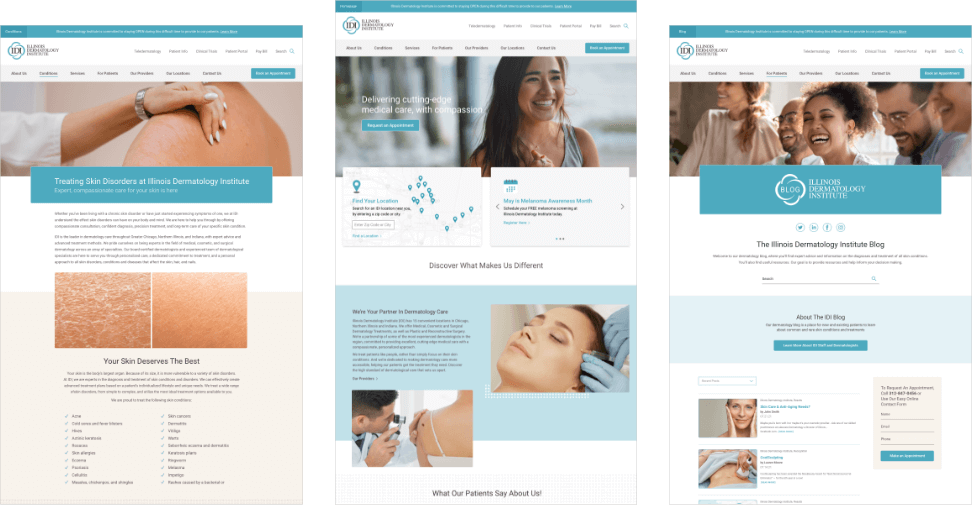
Visit the WebsiteThe web design for IDI focuses on intuitive navigation, engaging visual elements, and informative content, ensuring a seamless and educational online experience for patients and visitors.
Visit the Website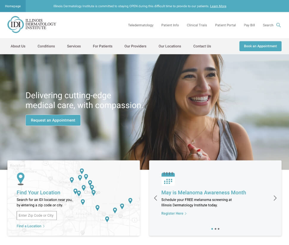

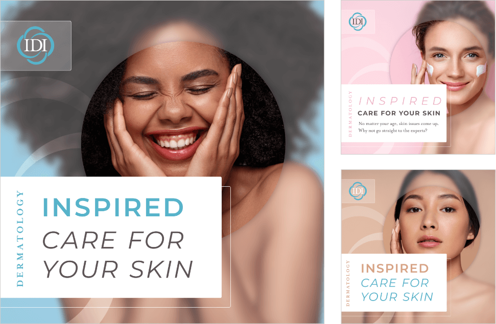
Social
IDI’s vibrant paid social ads bring color, imagery, and messaging together to stand out in the crowded feeds. A constant evolution to accommodate new trends and possibilities – we continue to push the IDI visual systems across platforms and technologies.
Landing Pages
Healthcare Succeess developed individual doctor and location-specific landing pages to accommodate targeted social and advertising campaigns — dramatically increasing trackable patient conversions.

Ready to explore a partnership?