Astera Cancer Care Rebranding by Healthcare Success
The Work
Healthcare Success partnered with Astera to develop its name, branding, visual system, and communication materials to position it as the north star to its patients during their treatment journey.
Brand
The Astera logo is optimistic, strong, and hopeful. It speaks to a combination of treatments working together to form a holistic approach and focus on the patient and their treatments.

Brand Applications:
Environmental
The Astera brand system is bold and fearless — and the environmental applications lean into those characteristics.
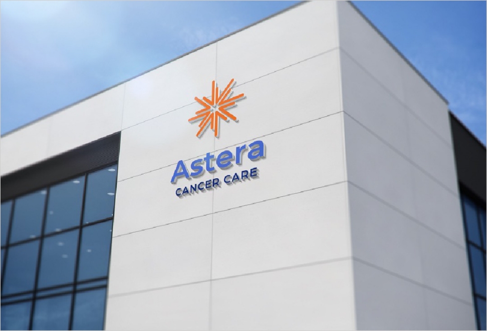
Signage
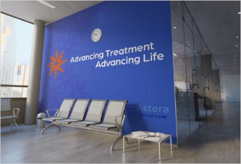
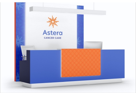
Environmental
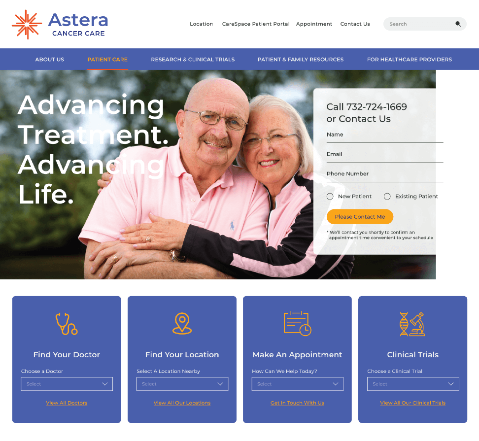
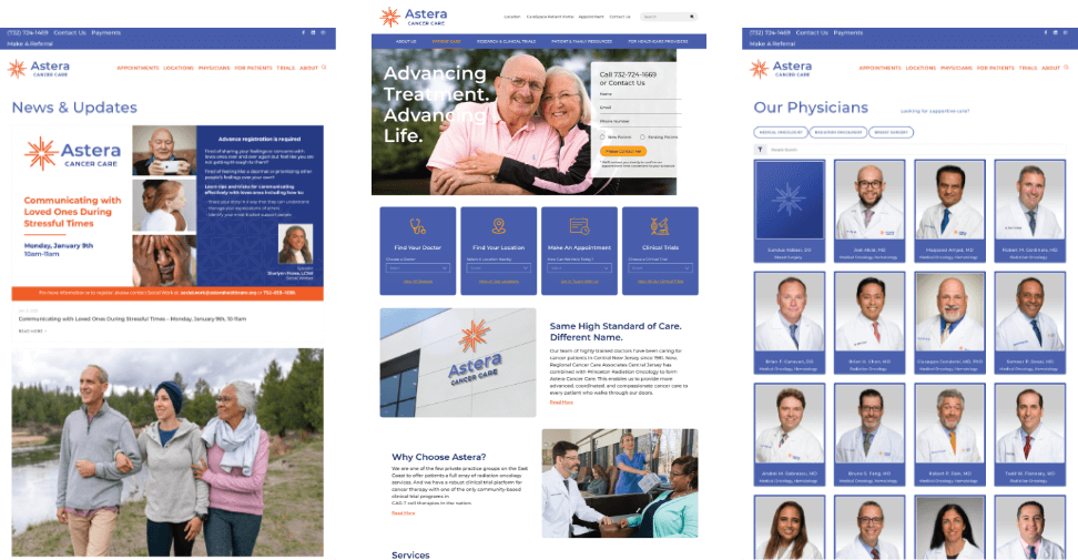
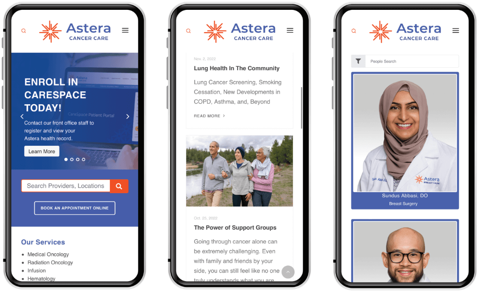
Website
Results are the primary focus of the Astera website design. Site imagery compliments its bright and optimistic color palette and reinforces treatment benefits. More importantly, site features are designed to deliver relevant information to the user quickly and efficiently.
Traditional
Further reinforcing the new Astera brand and visual system, Healthcare Success created a complete suite of traditional communication materials and executions across a wide variety of mediums and platforms.


Collected Print Collateral
Ready to explore a partnership?