Creating an Effective Marketing-Based Logo That Works Better Than Swoosh
Here's what goes into a hard-working healthcare logo that does a powerful branding job without a multi-million dollar budget and global exposure. Why you don't need or want a logo like Pepsi.
Picture this. Wouldn't it be terrific to have a logo for your medical group, hospital or physician practice that had the recognition impact of the Pepsi logo or the Nike "swoosh?"
Although we hear this level of expectation from providers occasionally, that notion goes in the "super-swell healthcare marketing fantasy" bucket. Appealing as it seems on the surface, here's why this retail comparison and logo misconception isn't realistic. And what to do instead.
First, consider the evolution of logos. Finding the earliest logos in history would take you back at least 5,000 years. Through the ages people have been using marks or graphic symbols of identification on ancient coins, royal seals, coats of arms, monarch monograms, craftsmen's hallmark and the like.
Over the centuries, the functions of a logo have not changed much. A logo represents a brand. It connects diverse forms of marketing to create an effective and memorable impression, and it's a mark of differentiation in a busy competitive marketplace.
It's an expression of ownership—what we might call branding in modern marketing talk—that is easily, perhaps immediately, recognized. That's pretty useful stuff in times when most of the population couldn't read at all. And just as useful in contemporary use when an enterprise or organization wants to communicate instant recognition.
The universally recognizable graphic symbol of Pepsi has a history of its own.
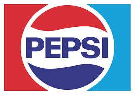
That which we immediately recognize as "Pepsi" today has been evolving for over 100 years of consumer product sales. Unfortunately, that's a "graphic equity" that healthcare marketing can't buy.
Design-based Logo vs. Marketing-based Logo
Pepsi, like many widely known retail/consumer logos, are design-based symbols. They are a distinctive graphic mark that has no specific definition other than the branding symbolism that is attached to it. (Exactly what is a "swoosh" without Nike?)
A design-based logo communicates brand value because of the massive exposure of the mark through high volume, repetitive, worldwide, big-budget advertising and marketing. Expectations on this level will fall short unless your budget includes exceptionally deep pockets. A design-based logo will not gain sufficient traction or equity to achieve the goals of your healthcare marketing plan.
For medical providers, organizations and institutions, the more cost-effective alternative is a marketing-based logo. Properly done, a marketing-based logo communicates what the product is or does, along with a sense of brand value. And it delivers a meaningful impression with far less exposure than the other category. This example of a marketing-based logo illustrates the three primary components:
- VISUAL ELEMENT - Here it's a graphic mark (stylized, caring heart), but other creative solutions are possible.
- BUSINESS NAME - The process of creating a name for a practice or organization is a mix of art and science...and the subject of another article.
- POSITIONING-BASED TAGLINE - a brief message that links the message to the business positioning statement.
Combining these three components is a creative process that can produce a number of options, each of which needs to tempered against the demographics of the intended audience and other considerations. The resulting marketing-based logo will be easily read and understood, work in a variety of sizes and applications, and have a not-too-trendy staying power.
A logo is not a brand...
From time to time we hear from someone who mistakenly believes that creating a logo is all that's involved in creating a brand or branding message. In fact, a logo is not a brand, but it represents a brand...and that's a larger subject that we've written about in this additional reference article.
Related Articles:
A Logo is Not a Brand: The Mark of Meaningful Values
Healthcare Branding Misconception: "The Community Already Knows Us!"
DOs and DON'Ts of Creating a Marketing-Smart (new) Name
Protect Your Brand: Trademark Essentials for Healthcare and Hospital Marketing