Midwest Integrated Care
The Work
During a time of progress and transition, Midwest Integrated Care partnered with Healthcare Success to help bring harmony to its integrated care vision. By connecting primary care and behavioral health, we helped shape a brand focused on compassion, human connection and a promise of whole-person care.
Identity
Logos
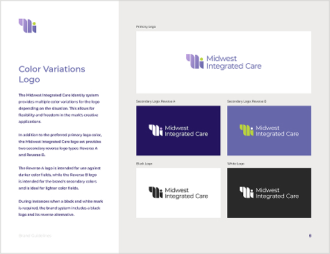
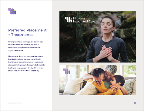
The Midwest Integrated Care logo is a visual story of unity. Its shape balances stability and movement, signaling trust and progress. The mark joins care components into a single, clear identity—a symbol of collaboration, purpose and care made whole.

Primary Logos

Primary Logos

Alternate Logos

Alternate Logos
Identity
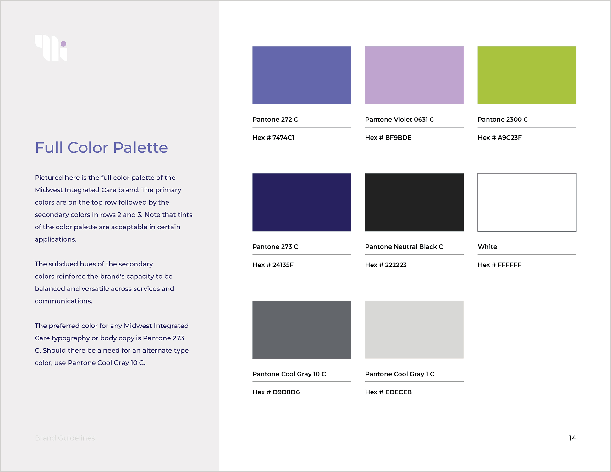
Color Palette
The Midwest Integrated Care color palette combines energy and calm. Cool violets and green primaries add vitality and trust, while secondary colors give balance and flexibility. Together, these colors make the brand welcoming and human.
Brand Guidelines
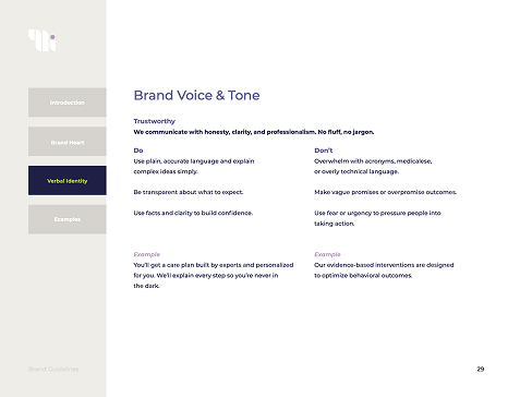
Midwest Integrated Care’s brand guidelines steer messaging, visuals and use across every area, helping teams share the brand clearly and confidently. This framework supports growth while keeping the brand's voice and heart.
Website Design + Development
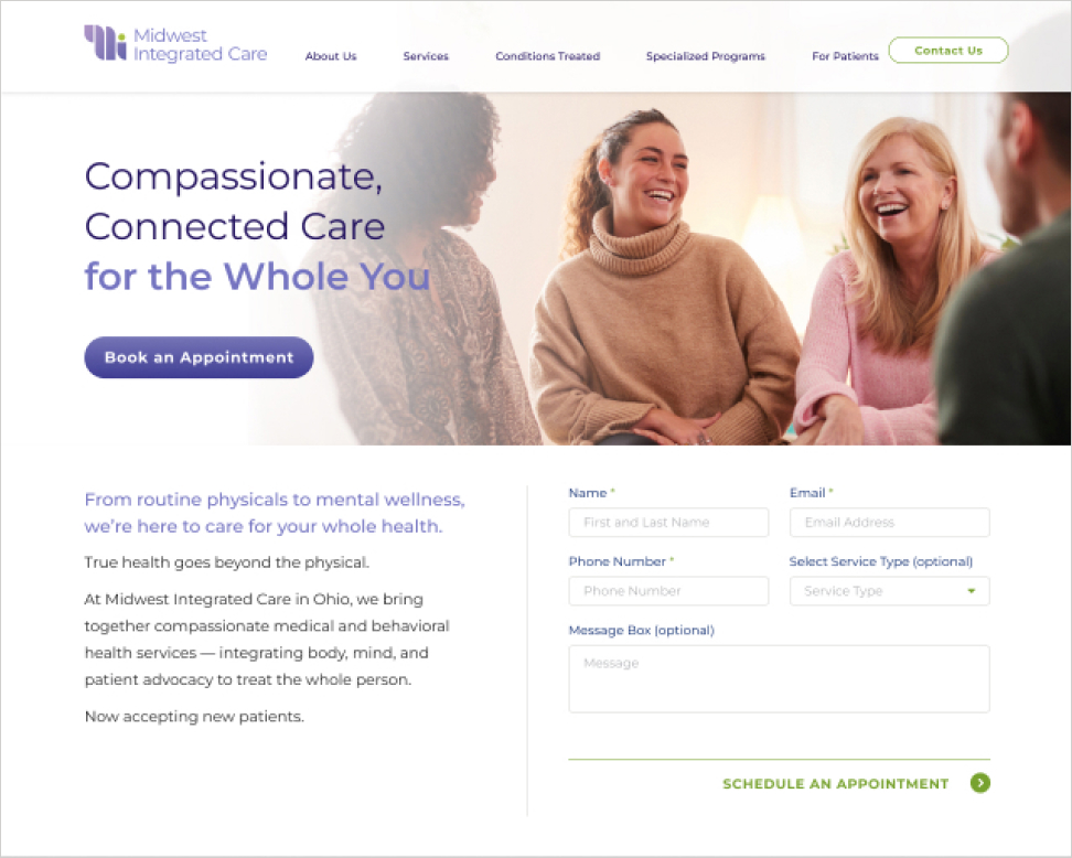
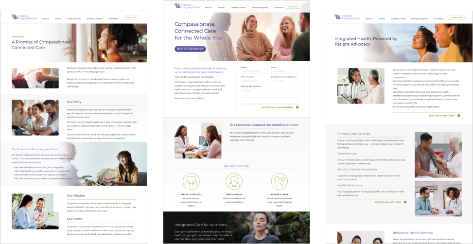
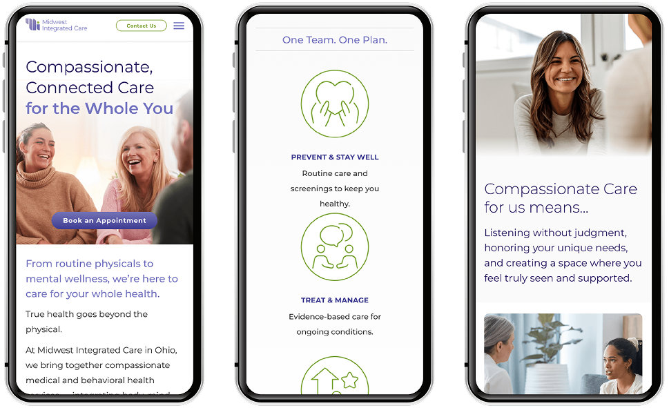
View the WebsiteThe Midwest Integrated Care website transforms complexity into clarity. Every page guides visitors with simplicity, offering an easy experience. Warmth, accessibility and credibility stand out, creating a digital home that reflects the organization’s leadership and compassionate ethos.
Ready to explore a partnership?